1.1. Welcome view
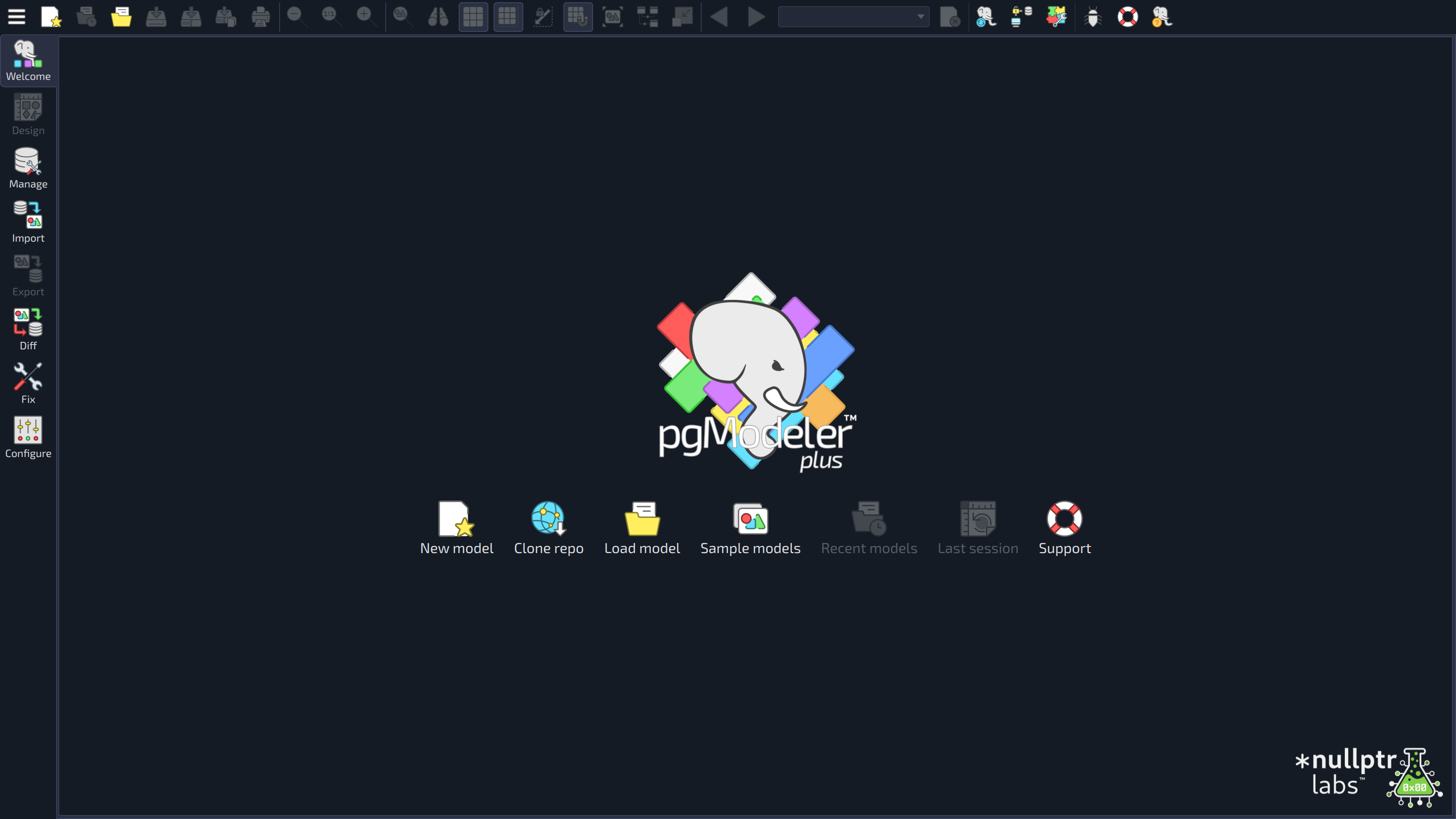
The welcome view is the first screen shown by pgModeler. In the image below, the control toolbar [1] and the views bar [2] are always visible, while the set of buttons [3] is the welcome view itself. Each highlighted area is described as follows:
 123
123
| Welcome view | ||
|---|---|---|
| # | Field | Description |
| 1 | Control toolbar | Gathers the most used actions of the main menu so they can be reached without expanding menus. From left to right: the button that opens the main menu Lock delimiters keeps the size of the page delimiter lines when the zoom factor is below 100%, so more objects fit in a single page. At the right side of the toolbar there are the button Donate |
| 2 | Views bar | Switches between the views of the main window: Welcome |
| 3 | Quick access buttons | These buttons are used, respectively, to create a new model |
 , Load
  , Save
  , Save as
  , and Print
  ), the zoom actions (Zoom out
  , Normal zoom
  , and Zoom in
  ), the tools Magnifier
  (
( (
( (
( (
( (
( (
( toggle.
 , which shows a panel inviting users to support the project (it is also displayed automatically on the first run and after an upgrade), the button New version found!
  , which appears when the update notifier finds a newer version and opens a panel with its details, and the actions added by plug-ins.
 , Design
  and, in pgModeler Plus, Manage
  , Import
  and Diff
  , plus the Export
  , Fix
, Fix  and Configure
  forms. While a model is being designed, the bar also shows the New
  and Quick
  buttons, which give access to the object creation menu and to the quick actions over the selected objects.
 Clone repo, provided by the Versioning plug-in), load models from the file system
  , load recently handled models
  , restore the last designing session
  , and open the support page
  .
.As can be seen, some operations like new and load can appear more than once in the main window. This is one of the several conveniences that pgModeler gives to the user so they can quickly access the desired feature without thinking too much or searching for it for too long.
Main menu
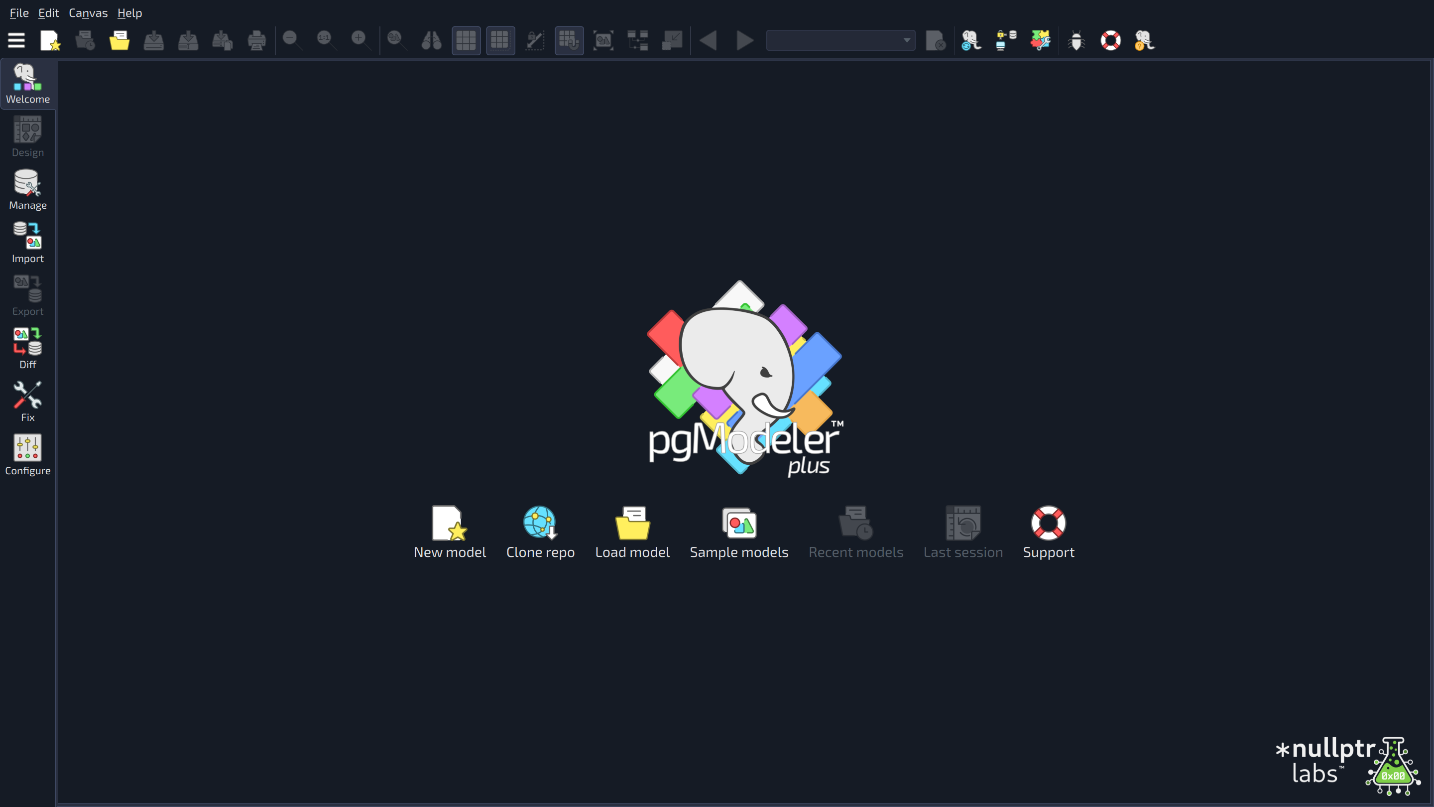
The main menu bar is hidden by default. To display it, click the button  at the left edge of the control toolbar and choose Show expanded.
 1234
1234
| Main menu | ||
|---|---|---|
| # | Field | Description |
| 1 | Main menu bar | The classic menu bar gives access to all the main operations. File has the actions to create, load, close, and save models, Print, Export, Restore Session (reopens the models that were open when pgModeler was last closed), and Exit. Edit has Undo, Redo, and Configure. Canvas groups the canvas options and tools of the control toolbar. Help has the support page, the bug report dialog, Check for update, and About. The bar is hidden by default and its menus are available through the button at the left edge of the control toolbar. To display the bar in the classical way, click that button and choose Show expanded ( |
| 2 | Control toolbar | Gathers the most used actions of the main menu so they can be reached without expanding menus. From left to right: the button that opens the main menu Lock delimiters keeps the size of the page delimiter lines when the zoom factor is below 100%, so more objects fit in a single page. At the right side of the toolbar there are the button Donate |
| 3 | Views bar | Switches between the views of the main window: Welcome |
| 4 | Quick access buttons | These buttons are used, respectively, to create a new model |