4.2. Appearance settings
This widget is used to configure the UI general style, font, and color settings for graphical objects as well as to define the source code font and highlight settings.
4.2.1. Interface & Code
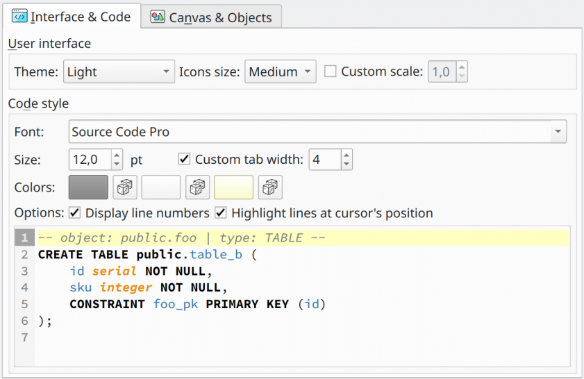
Interface
| Option/Action | Description |
|---|---|
Theme | Specify the user-interface theme color. This option changes the color of widgets as well as the source code highlight configuration to match the color set of the UI. |
Icons size | Defines the size of the icons in the user interface. |
Custom scale | Defines a custom UI scale factor. This factor is applied when drawing widgets and fonts. Requires restarting pgModeler when in use. |
Code style
| Option/Action | Description |
|---|---|
Font | Defines the default font family to be used in any field that is used to display source code. |
Size | Defines the default font size for source code fields. |
Custom tab width | Defines a custom tab width in source code fields. |
Colors | This group of color pickers is used to configure some attributes of the source code fields. The first color picker defines the color of line numbers, the second one determines the color of the background of the portion where line numbers are exposed. Finally, the last picker is used to set the color of the highlighted line (where the cursor is currently placed). |
Display line numbers | Toggles the line numbers in the source code fields. |
Highlight lines at cursor's position | Toggles the color change for currently selected lines. |
4.2.2. Canvas & Objects
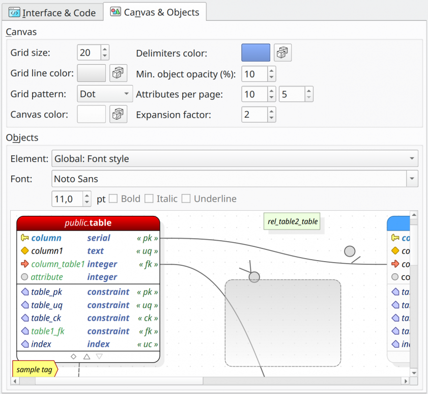
Design
| Option/Action | Description |
|---|---|
Grid size | Defines the vertical and horizontal grid size. This value affects the spacing of objects when using the feature that aligns the objects on the grid. |
Grid line color | Defines the color of the grid lines. |
Grid pattern | Defines the grid drawing pattern between Square and Dot. |
Canvas color | Defines the background color of the canvas area. |
Delimiters color | Defines the color of the page delimiter lines. |
Minimum object opacity (%) | Defines the minimum opacity percentage applied to the objects when using the fade-out feature. A zero opacity causes the object to be completely hidden, making it impossible to interact with it in the canvas area. |
Attributes per page | These spinners define the minimum number of attributes visible per page in each section of tables and views when pagination is enabled on them. The first one controls the number of columns per page. The second defines the number of extended attributes (constraints, indexes, triggers, rules, policies) displayed per page. |
Expansion factor | The expansion factor is the number of times the current page dimension (width and height) is used to expand the canvas geometry to a certain direction (top, left, bottom, or right). The page dimension can be adjusted in the printing options. |
Objects
| Option | Description |
|---|---|
Element | Identifies the currently configured style item. |
Font | Defines the font family for the current element. Additionally, the user can specify the font size (in points) and the attributes in bold, italic, and underlined. |
Colors | Defines each color attribute for the current element. For graphical objects, there are three configurable colors. The first two are the fill color (gradient) and the last one is the border color. For font style elements, there is only one color available, which is the foreground color. |